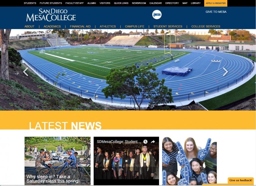
The Mesa College website debuted a new look to go along with the distinguishable evolution of the campus, reflecting the new era ahead of the expanding school.
The new and improved site was inaugurated under the same domain approximately two weeks ago and has several unique and state of the art features that sets it apart from other community college websites.
“It was time for a change,” said Lina Heil, the public information officer at Mesa, in a written statement. “We wanted a site that was more in sync with what users expect today, more visual, easy navigation and most importantly, a responsive design.”
The home page proudly displays the school’s colors and greets visitors with images showcasing students engaging in school activities in the campus whether they are selecting a textbook at the bookstore, or juggling in one of the quads; it aims to show the relaxed but vibrant environment of the college.
Another notable feature that instantly reels visitors in, is the clear layout and sections listed on the home page so that guests know exactly where to go, whether it be information regarding the departments or viewing upcoming events in the school calendar.
“What we’re looking at is streamline and navigation,” said Joel Arias, who is the web designer and developer of the site, as he discussed his goal in redesigning the webpage. “Make the information that people are looking for easy to find and make sure that information is at the forefront of the site, not buried, you know, three or four pages deep.”
The site was upgraded to a sophisticated system called OmniUpdate, which is a program universities and other high academic institutions use for their websites.
Heil and Arias both shared the same goal of making the site available on smart phones and tablets, which according to Arias over 50% of students visit the Mesa page through their portable devices.
“There’s so much going on in the areas of design and how people access information,” said Heil. “One of our first goals was to make it usable across all platforms.”
The newest feature that has become critical to the page is the feedback bar, where users can contribute to the development of the site. According to Heil, more features are expected to launch soon such as the Newsroom, which will be an informative page about the college on a more personal level, and Ask Mesa, in which visitors can ask a questions and will receive an intelligent answer though a program called IntelliResponse.
Heil credits the Vice President of Administration Rachelle Agatha, in helping lay the foundation in the re-launch by gathering the opinions of students and faculty members through a survey to fulfill the needs of their audience.
“It’s very simple. The pictures are very high quality,” said Mesa College student Priscilla Maestro, as she navigated the site. “I like how they have the campus events and the social media right on the front page because that automatically tells you to get involved.” Psychology major and student, Lena Luangamath said “The new Mesa website is very organized; it makes it easier for students to navigate through the menus.”
The 18 months the refurbished website required will continue to develop into a sophisticated but practical page that not only students will find useful, but also curious visitors.
To see the new website for yourself visit: www.sdmesa.edu


